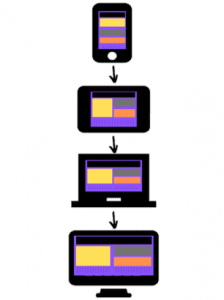
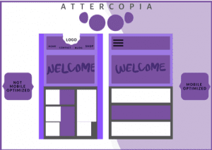
Responsive web design ensures that your website offers an equally excellent user experience to people on any device or browser. It’s worth your while because it satisfies SEO and customer demands so completely that search engines like Google absolutely love it.

Responsive web design is an elegant solution to optimisation challenges that makes website owners, mobile users and search spiders smile from ear to ear.
If you want a comprehensive lowdown on exactly what it is and why it’s important for your business, you’ve come to the right place.
Where did responsive web design originate?
The concept was first introduced in an Ethan Marcotte A List Apart article.
In this seminal piece, Marcotte discusses the discipline known as ‘responsive architecture’, whereby buildings are constructed with tensile materials and use embedded robotics to optimise the environment for people inside – for example, by lowering the temperature to counteract body heat when they’re unusually busy.
He then applies this principle to web design – in the same way that you wouldn’t build multiple buildings for different people, you wouldn’t (or rather shouldn’t) have to create numerous websites for diverse users. Instead, you should be able to create one website that caters for all.
So responsive web design empowers designers to build a single custom website that simultaneously meets the needs of various groups of users.
When a site is responsive, a user can switch from a desktop computer to a smartphone and even change the orientation of their device – and the webpage will automatically modify to provide the optimum layout (e.g. less columns of text on smaller mobile device) that allows users to enjoy a consistent high quality viewing experience.
Customers now expect this type of seamless functionality and it’s brilliant for businesses because it means that you can connect with customers at any time and touchpoint.
How do you get started with responsive web design?
If you’re new to the world of responsive web design, don’t worry – this blog will help you get up to speed. We’re going to cover all of the important points, including:
• The three features of responsive web design
• Mobile optimisation
• Thumb friendliness
• The differences between responsive and adaptive web design
• The most popular screen resolutions
• The benefits of responsive web design
The three features of responsive web design
Responsive web design is characterised by three defining features. These are media queries, fluid grids and flexible visuals.
1. Media queries
Media queries are used to create CSS rules (Cascading Style Sheets), a presentation language used to style the appearance of webpages.
In responsive web design, they can be used to control a variety of webpage parameters including max-width, max-height and aspect ratio. Media queries also enable developers to use condition checks in order to change a web design based on the properties of a user’s device.
2. Fluid grids
You can use CSS to create fluid grids, which are used in responsive web design to format columns of text so that they automatically re-size in proportion to the size of the browser being used.
By using percentages, as opposed to pixels (which can vary in size depending on the device), CSS fluid grids enable webpages to change into a size that’s relative to that of the browser display space. This allows you to build a site where the same image always takes up the appropriate proportion of page space, which enables designers to create a consistent visual appearance across numerous devices.
3. Flexible visuals
Flexible visuals allow you to adapt images and other media to load differently depending on the size of the device being used.
For example, if you were optimising a desktop site for mobile devices, you could use CSS to set the maximum width of an image to 100% of the screen size, so that when that 100% becomes narrower, the image does too.
When these three principles are combined, they enable designers to create responsive websites which are perfectly prepared for endless device innovations.
Mobile optimisation and responsive design
When it comes to conquering the internet, mobile optimisation is essential. In fact, according to Statista, in 2018, 52.2% of global website traffic came from mobile phones.
And while the growth of mobile technology has brought about simplicity and convenience for consumers who can now carry out web searches on the move, it’s added a further degree of complexity to the already tricky technical field that’s web design and development.
For instance, the above statistic it means that businesses now need to create multiple versions of their website that are compatible for the full range of mobile devices, screen sizes and resolutions out there – or face losing more than half of their potential site visitors.
But responsive design makes mobile optimisation child’s play – enabling seamless and consistent customer experiences on PCs, tablets and phones that allow your company to capitalise on every opportunity.
Thumb friendliness and responsive web design

When considering web page layouts for mobile devices, it’s not just resolution and proportion and readability that you need to consider – another key factor is thumb friendliness.
For many mobile users, the thumb serves as their cursor when browsing with one hand. So in terms of layout, this means that navigation bars and interactive buttons are best placed centrally, (away from the corners) to enable users to reach them with ease.
By making the mobile user experience as straightforward as possible, not only are you effectively optimising your site for a growing market, you’re also providing a user experience that is memorable for all of the right reasons – this gets a thumbs-up all round.
Responsive vs adaptive web design
Before the responsive web design craze took off, another style of web design known as adaptive web design was used to mobile optimise sites – and in fact, it’s still used today.
So what exactly is the difference the difference between responsive and adaptive web design and why mention it in a blog about responsive web design? Well, the two are closely connected so by comparing the them, you’ll gain a deeper understanding of responsive web design.
The main difference between responsive and adaptive web design is that responsive uses a singular fully-flexible site layout that responds accordingly to any device size and screen resolution. Adaptive, on the other hand, uses various static site layouts with each one designed for a specific screen width.
This immediately brings to light a key limitation of adaptive web design, in that you’re required (in theory) to build a new layout each time a new device or screen type is released, and in the fast paced tech world, that can mean a huge amount of work.
Pros and cons of responsive and adaptive web design
With responsive web design, you need only work on a single layout. However, a lot more coding work is required as you’re essentially designing infinite layouts for infinite screen sizes. Plus, your site still might not look quite as superb on certain devices.
Another key difference between the two is the aftercare. Websites require ongoing monitoring, tweaks and adaptations – so when you have an adaptive site, that means working across all of your layouts. In contrast, while responsive web design might require more work at the outset, this pays off in the long term because you’ll benefit from having just one fully fluid site to take care of.
Furthermore, the difference in the level of aftercare required makes responsive web design a better option for businesses looking to start their website from scratch, and adaptive a good fit for site improvement projects. Ultimately, the choice is yours, so consider your budget, available resources and types of devices people are using to access your site.
Like most things in life, responsive and adaptive web design have their good and bad points. However, what makes responsive web design that bit more appealing is that it allows you to futureproof your site so that when that next tech device comes along, minimal work is required.
The most popular screen resolutions for responsive web design
The thought of designing a site to suit an endless amount of screen sizes can seem daunting. But it doesn’t need to be, because certain screens types are more common than others and therefore more likely to be used by your website visitors.
To provide a clear starting point for your web design project, here are the most popular screen resolutions to consider when using responsive web design techniques.
The six most popular screen resolutions (2019)
| Resolution | Percentage of users | Device type |
| 360×640 | 16.88% | mobile |
| 1366×768 | 8.85% | desktop |
| 1920×1080 | 7.75% | desktop |
| 375×667 | 4.63% | mobile |
| 360×720 | 3.32% | mobile |
| 360×760 | 2.50% | mobile |
What this data shows is that while mobile use is on the rise, there’s still a need for web designers to work on layouts across the spectrum of desktop and mobile.
What are the benefits of responsive web design?
Now that you’ve got a good overview of how responsive web design works and its features, let’s take a look at the main benefits of responsive web design.
1. Better user experience
If you want users to buy your products and keep coming back to your site, it’s essential that you offer them a positive user experience. Responsive web design achieves this by ensuring your webpage media and text load quickly and in the optimum size and resolution for any device.
2. User-focused
Responsive websites are created with the users in mind and thus prioritize customer experience. Rather than try to squeeze the same desktop layout on a small mobile screen, which would require more work on the part of the user (e.g. zooming in on text), the display adapts to suit their specific needs.
3. Longer sessions
When your site can provide visitors with a simple but engaging user experience, they’ll be more likely to stick around for longer. This increases the likelihood of them following your calls-to-action (CTAs) and completion of conversions like newsletter subscriptions, calls or sales.
4. Cost effective
Managing different sites for your desktop and mobile users can be costly. But with responsive design, you need only invest in a single site that has the capability of appealing to all visitors, devices and browsers. It’s also time-effective because should you need to make any changes to your site, you’ll only have to tweak once, rather than repeating alterations for each version of your site.
5. Improved SEO
SEO is the practice of using non-paid methods to achieve a high search engine position and since July 2019, Google has indexed mobile versions of new websites first when determining their position. Consequently, responsive design increases your chances of achieving or maintaining a marvellous Google ranking, with the increased traffic and business this brings.
Key takeaways
- Responsive web design enables your website to deliver a consistent high-quality user experience across all internet devices.
- It’s underpinned by three features – media queries, fluid grids and flexible images. These are combined to create a site that looks and functions fantastically across browsers and device types.
- Responsive web design is a better business alternative to adaptive web design because it avoids duplication of work and inefficient use of resources, as it requires you to focus on a single site layout rather than multiple independent ones.
- Responsive web design enables you to take a proactive approach to web development by creating a flexible framework that’s well prepared and equipped to meet the design needs of future web browsing devices.
Responsive web design is a worthwhile long-term investment in the journey towards a high-quality multi-platform user experience.
So it’s a savvy investment for designers and businesses looking to create first-rate digital experiences that exceed customer expectations and boost website conversions.
Need our web design expertise to excel? Contact us today.


